I worked at Skinny Tan first as a freelancer and then joined the team permanently as an integrated designer. Creating everything from packaging to launch campaigns. Attending and art directing photo shoots, re designing the packaging and creating a new brand visual language to put the brand in a more premium space.
Packaging design refresh
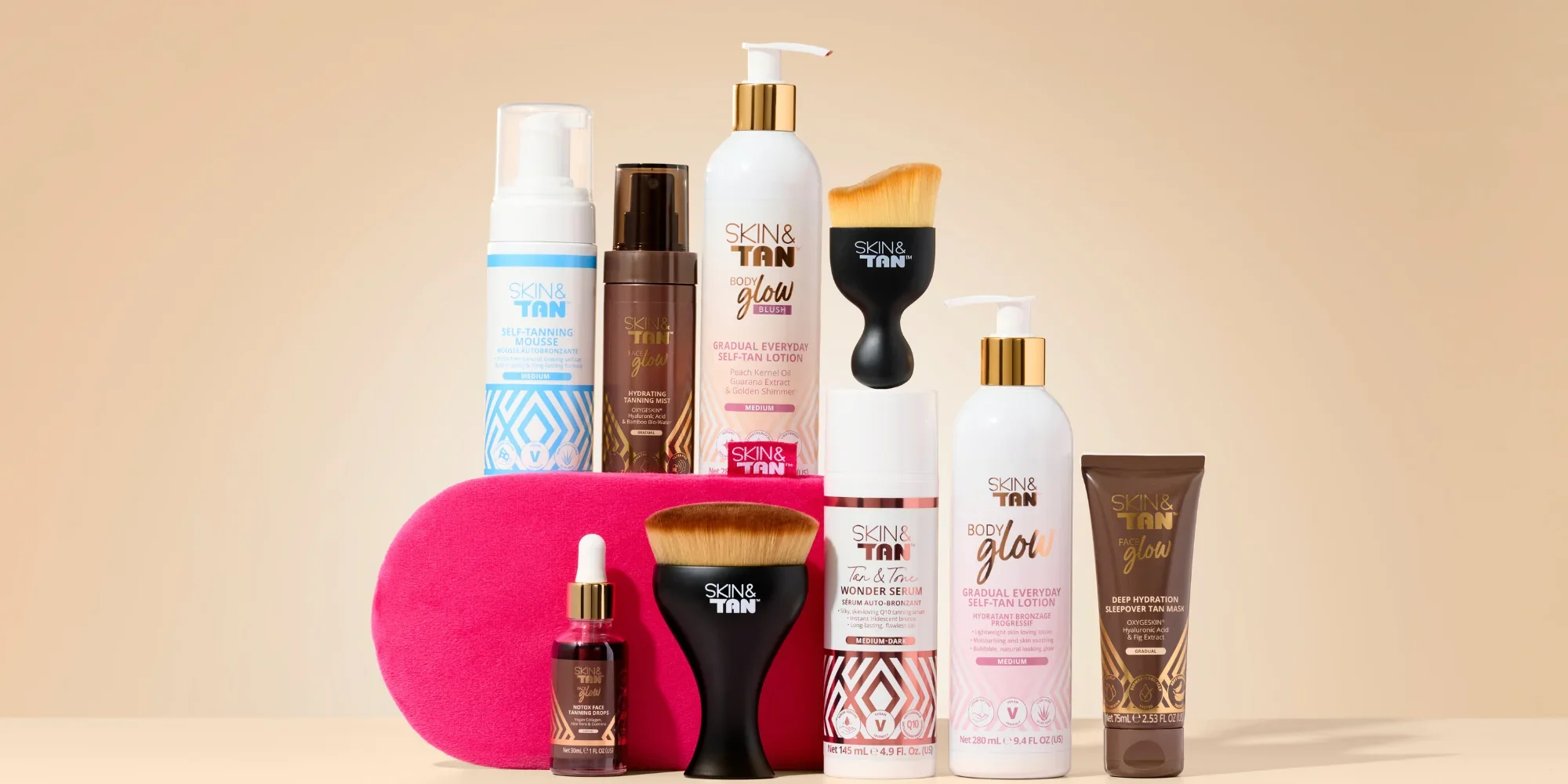
Working with the CEO and head of brand I re aligned the brands offering. Creating clear ranges with easier consumer shopping journey.
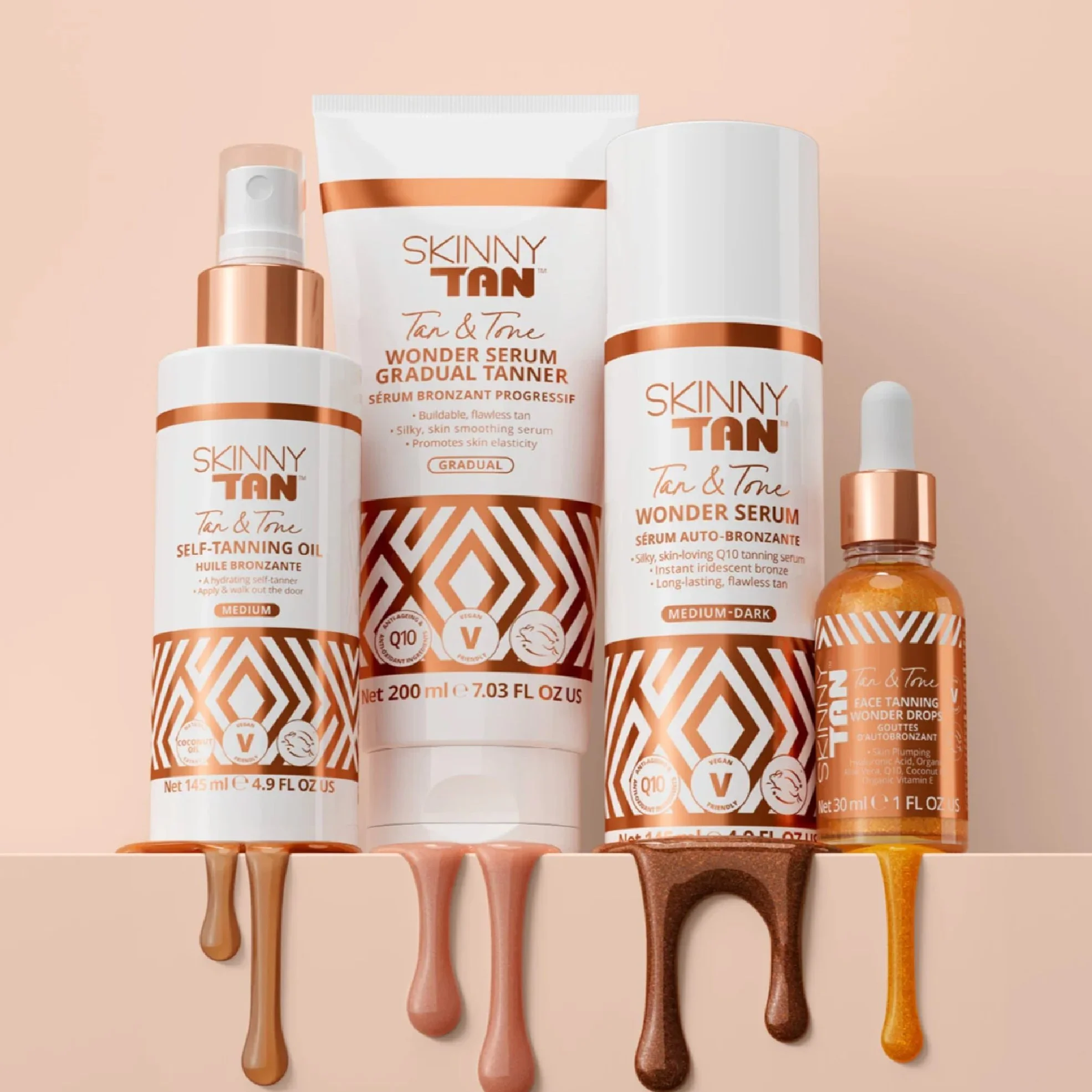
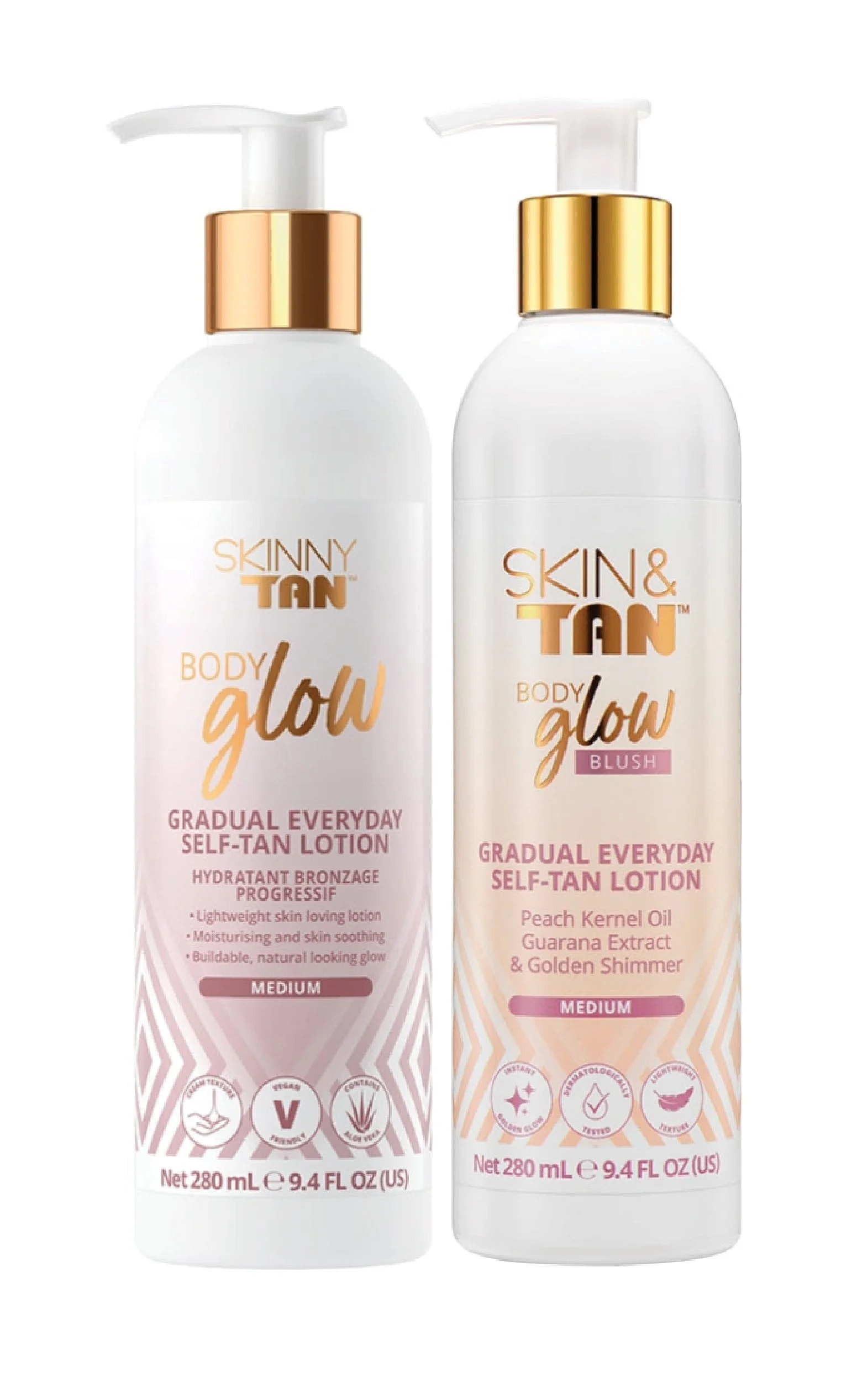
Skinny Tans formulas weren’t just about tan they were about skincare too and the packaging needed to reflect this with a more premium skincare looking approach. Highlighting skin benefits as well as the tanning.
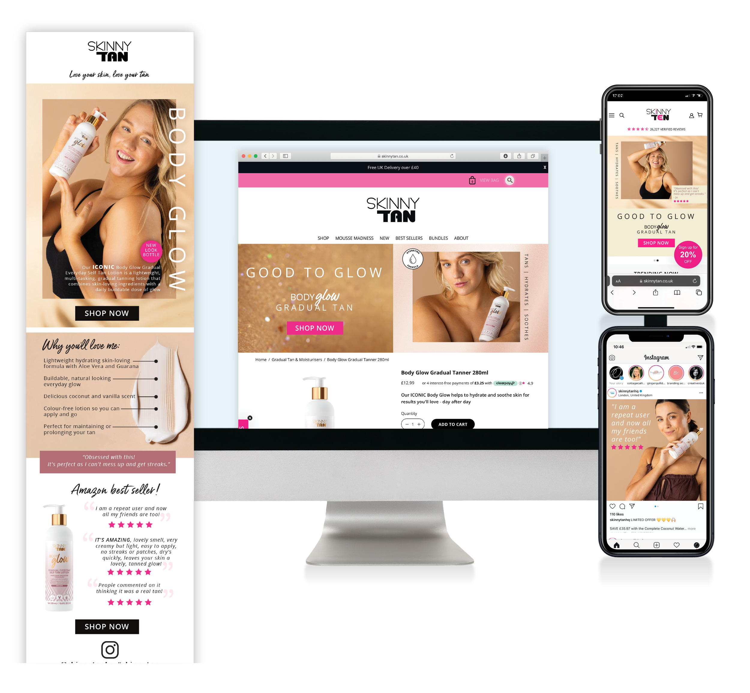
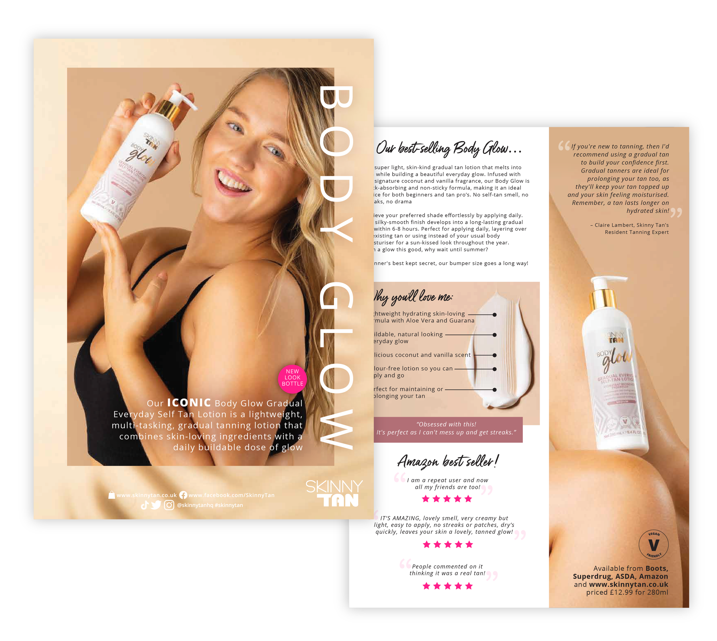
BodyGlow is one of Skinny Tans top selling products. An gradual tan that is kind to skin and appeals to all ages, an excellent beginners product into the world of tanning. But the packaging was looking dated and did not fit with the new branding so a new look was needed. This also meant that the consumer already buying the product needed to be taken on that journey too.
As the tan is soft I wanted the packing colour palette to reflect this. Making the bottle warm, approachable and friendly. The subtle gradient not only represents the gentle development of colour but creates the safe feeling required.
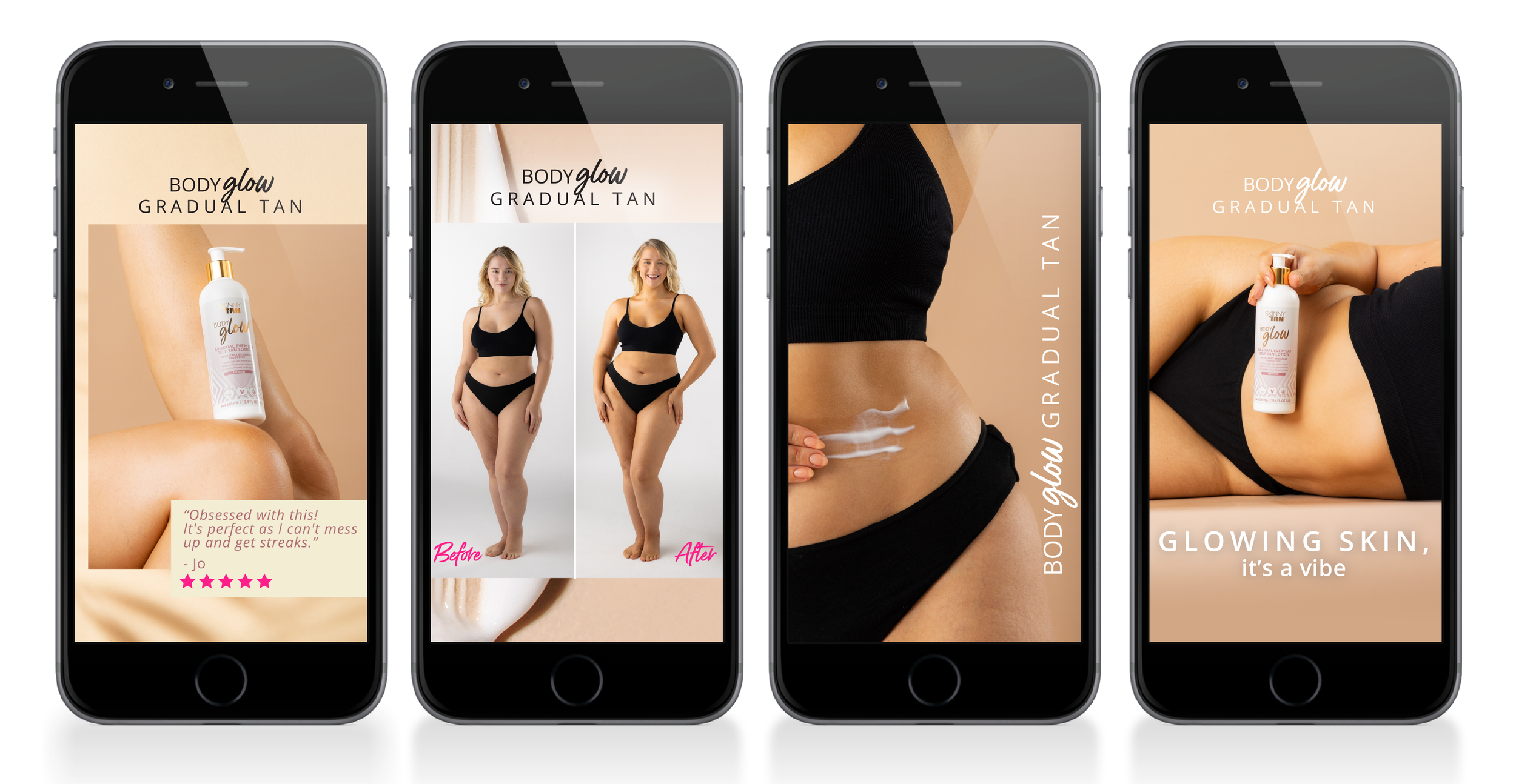
We wanted the same feeling for the launch. A gentle “by the hand” approach into the world of tanning. Soft hues and textures in taupe and beige, pale creams and pinks reflected the gentle nature of the product. Using a “plus size” model showing her gorgeous curves and natural shape showed the consumer a confidence and a truth. That every body is worthy of feeling great.
Re launching an icon
PAckaging design & DIGITAL CAMPAIGN For Cherry Tanning drops
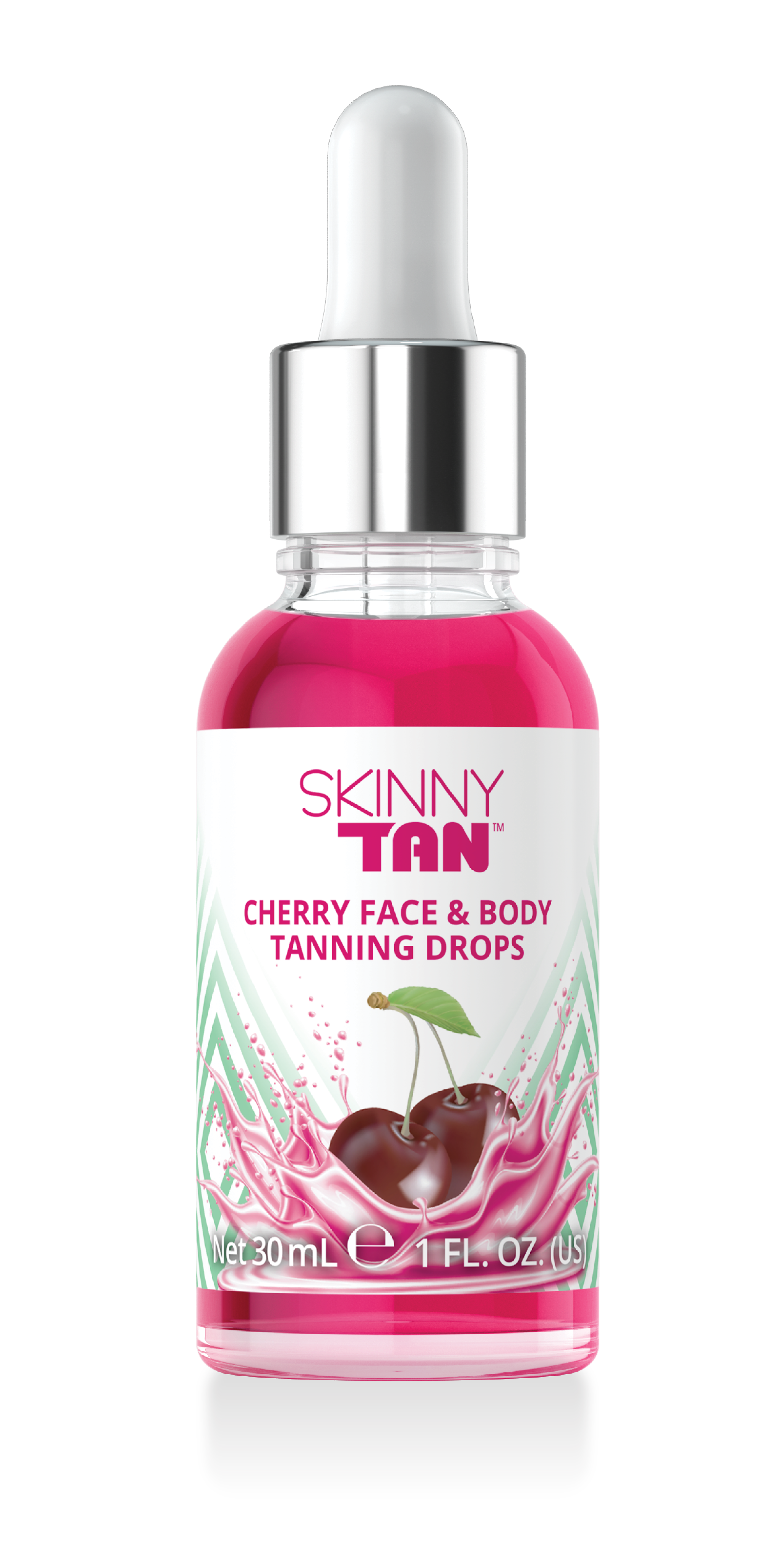
Tanning drops are a huge part of Skinny Tans arsenal. Allowing the consumer to create their own level of tanning intensity. Cherry drops was their summer launch. Different to other products as this wasn’t about skin benefits it was more about the fun and the scent of them.
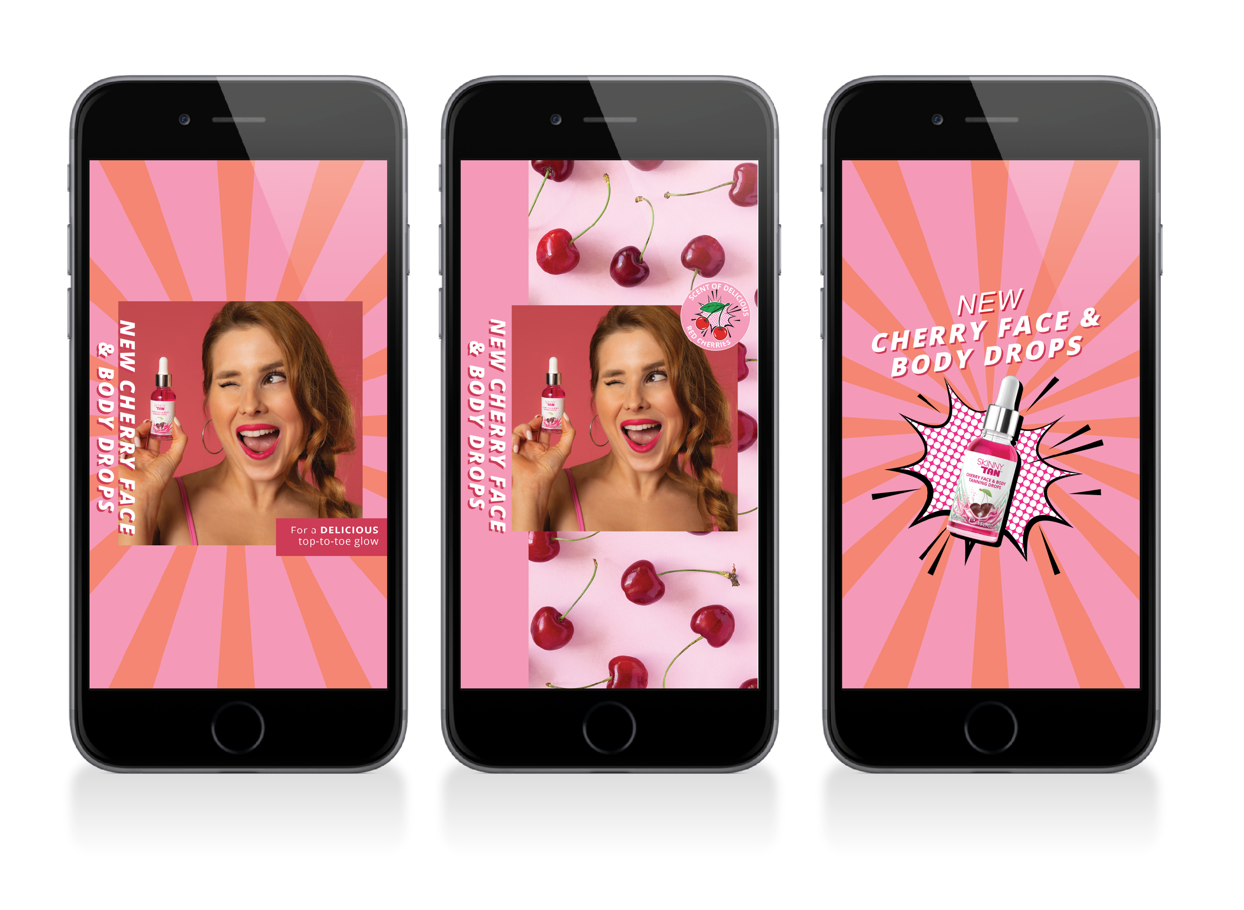
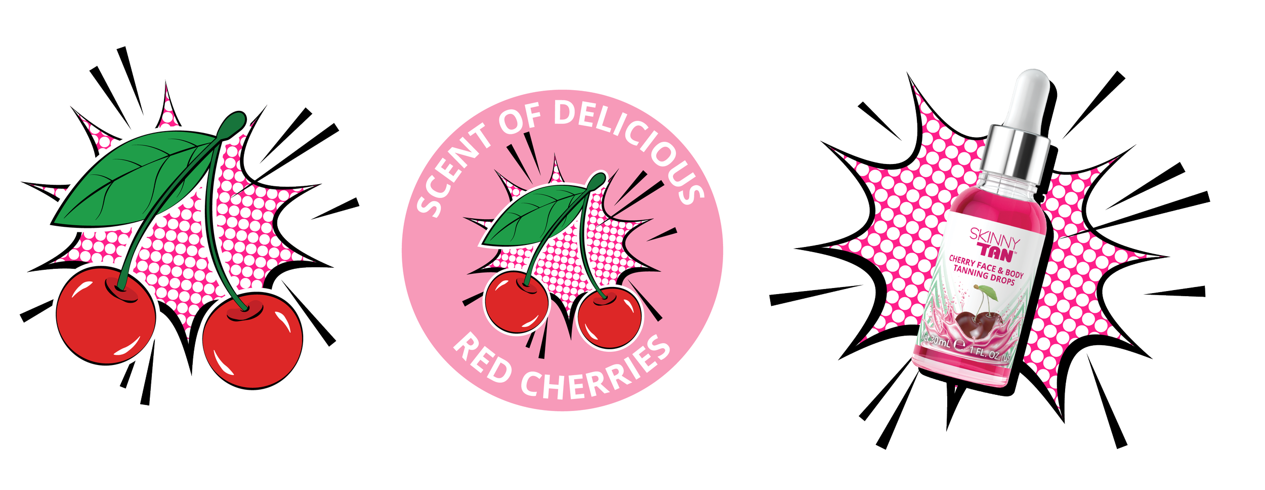
The launch needed to reflect the dynamic and fun appeal of the product. Highlighting the scent as the key USP and also utilising the amazing formulation colour.
The campaign was inspired by 50s pin ups and was bold, bright, cheeky and fun - just like the product.

Black friday campaiGn
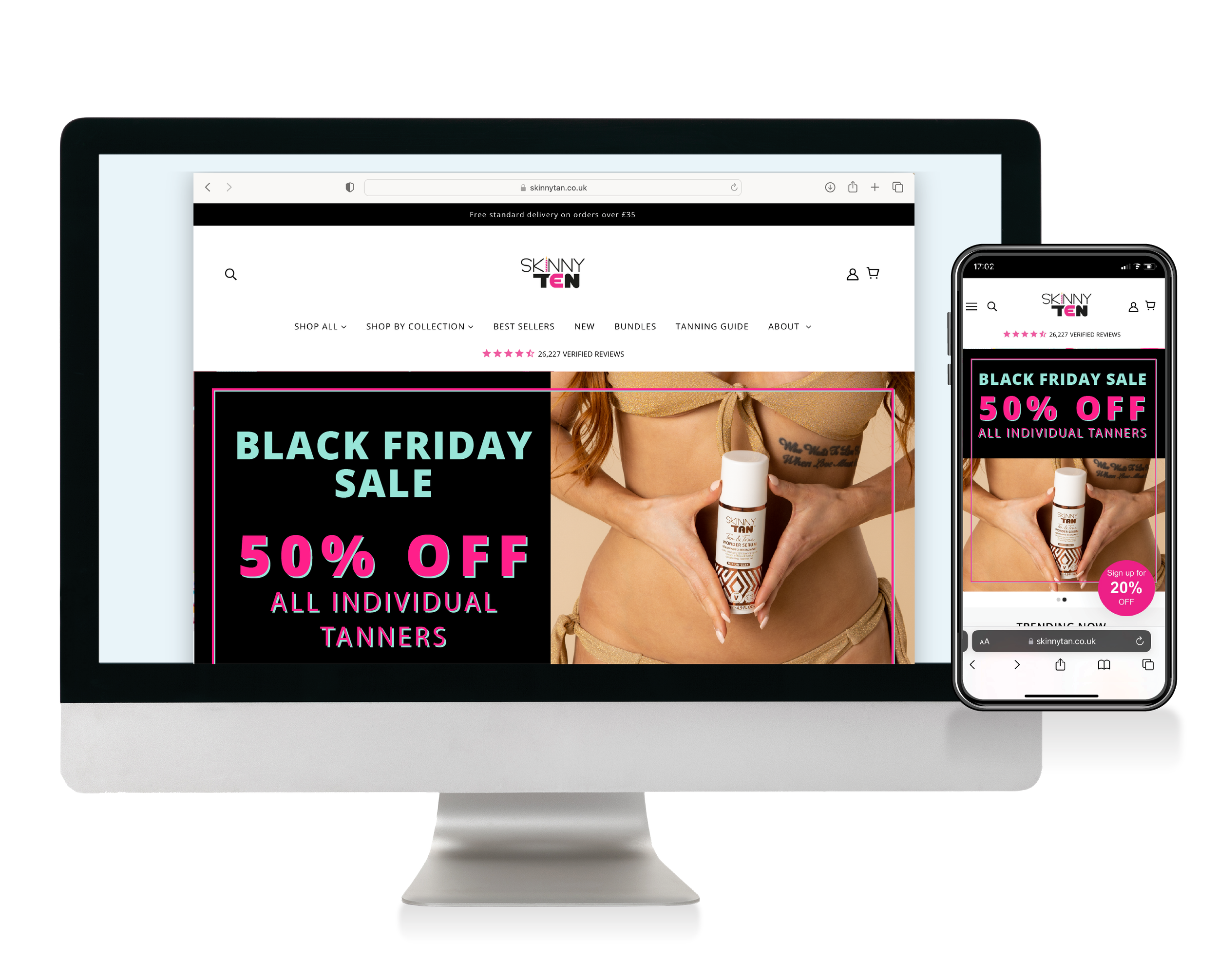
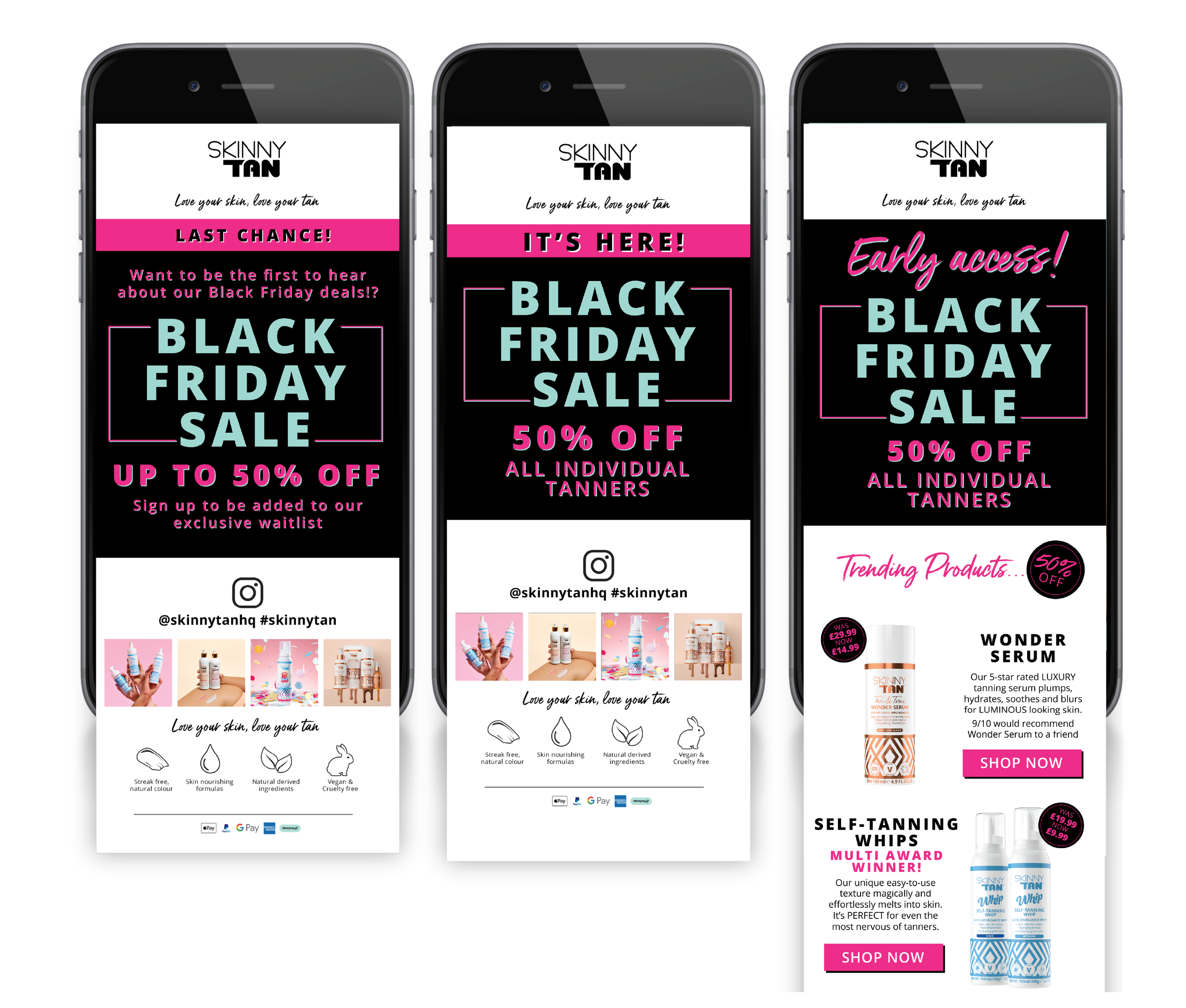
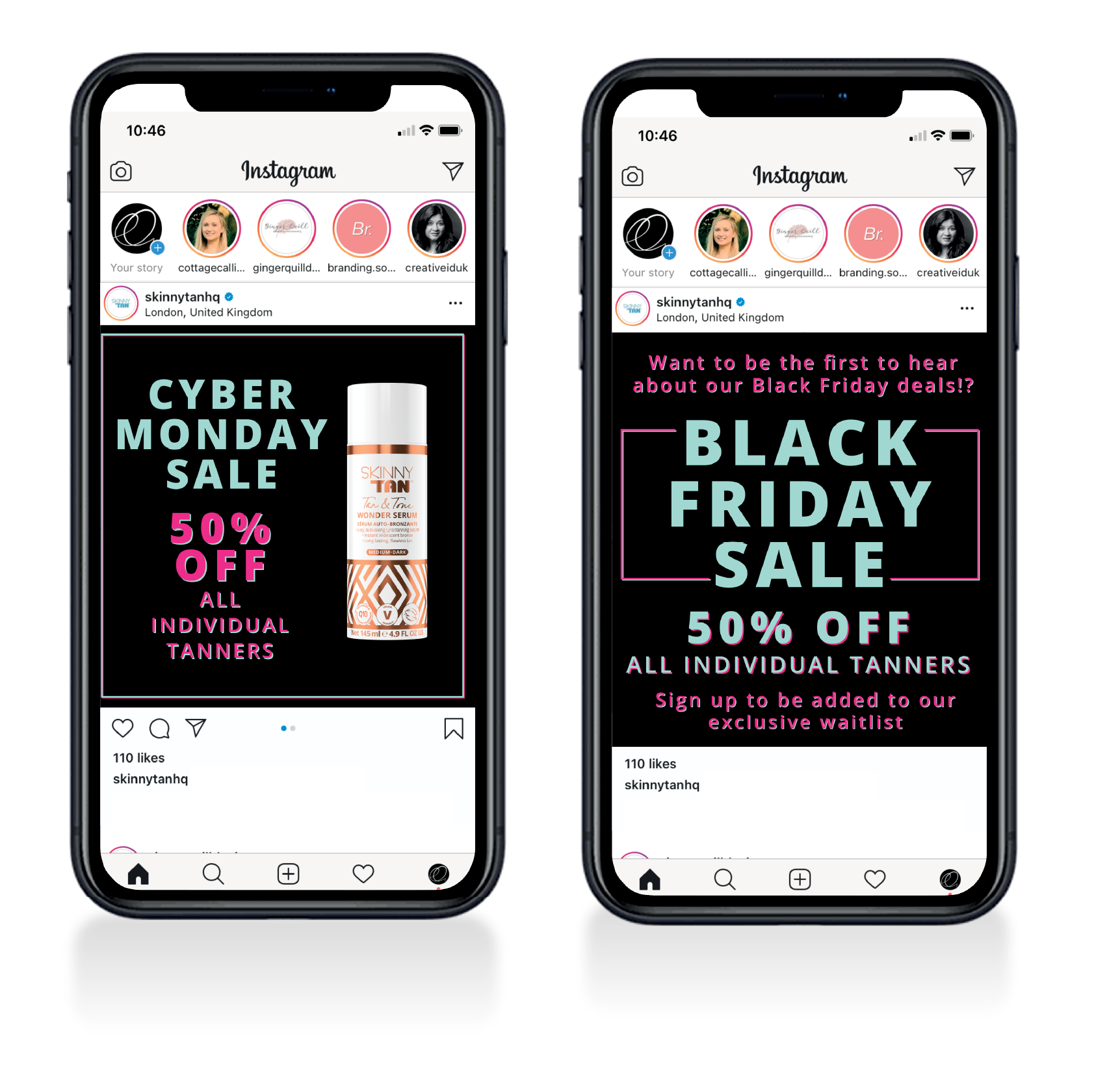
Black Friday is one of the biggest sales opportunity in the brands calendar. Customers wait and anticipate the sale. I created a bold look that was the opposite of the normal lighter colour palette of the skinny Tan emails. This grabbed the consumers attention and shouted loudly about the sale. Using the brands key colour - pink - to highlight important messages and points about the sale meant that the consumer knew exactly what this sale was.