For nearly 5 years I worked as Superdrug's Lead Packaging designer creating ranges across all category areas for the company.
Managing work flow within the team, presenting to key stake holders and attending press passes.
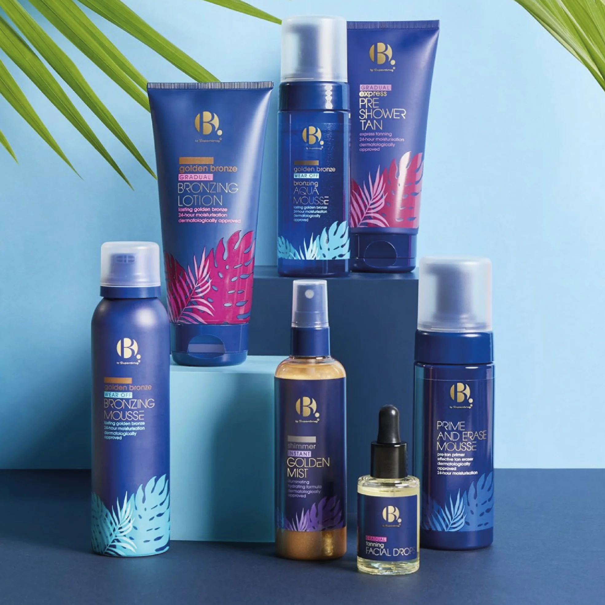
SELF TAN RE DESIGN
The aim was to shake up the self tan aisle and make Superdrugs own brand offering the consumer go to.
I used bold colour blocking which immediately draws the consumers eye. Playful and characterful text kept the category light hearted and fun, capturing the essence of a sun tan and holiday vibes.
The holding shape behind the text symbolises a “swipe” of tan formulation, this shapes enables clear navigation for product type (through colour) and supports the tan shade lozenge helping the consumer to the right product quickly and easily, holding their attention and gaining trust.
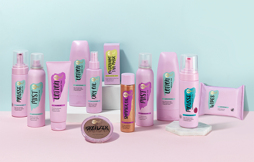
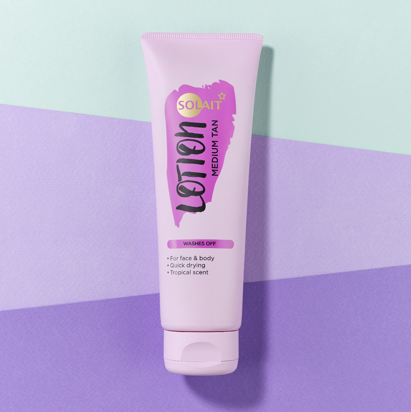
Sales increase of 200% from re design alone.
DRY SHAMPOO
The consumer market was changing - more males were buying into dry shampoo. Superdrug wanted to create a gender neutral offering appealing to both genders.
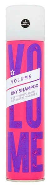
I immediately removed all humans - hair, face everything. Removed all gender stereotypical fonts and focused on bold colour combinations (again avoiding stereo typical gender colour combinations). I focused the designs energy on the benefits. This allowed me to create a neutral and fun design that would appeal to both sexes.
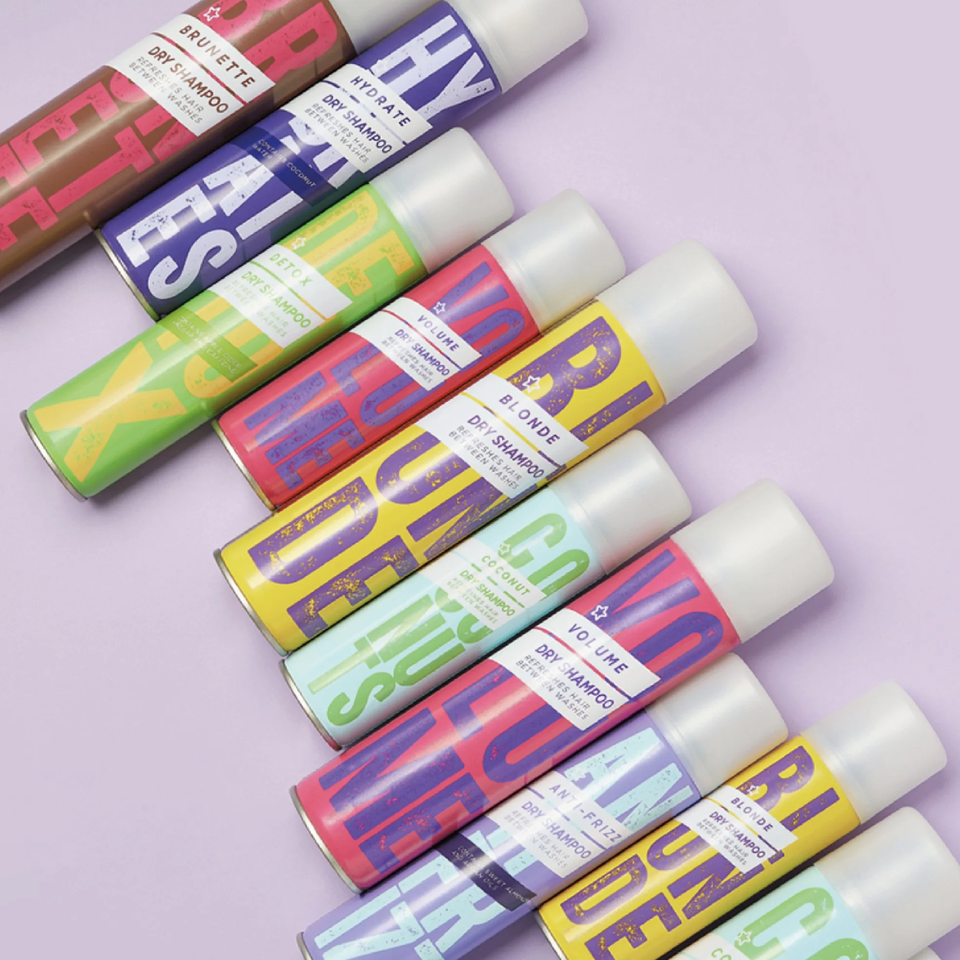
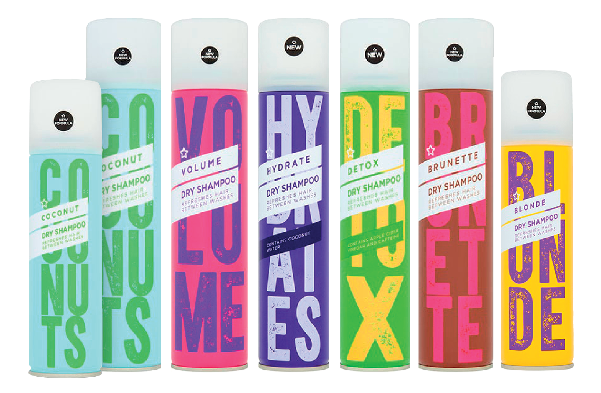
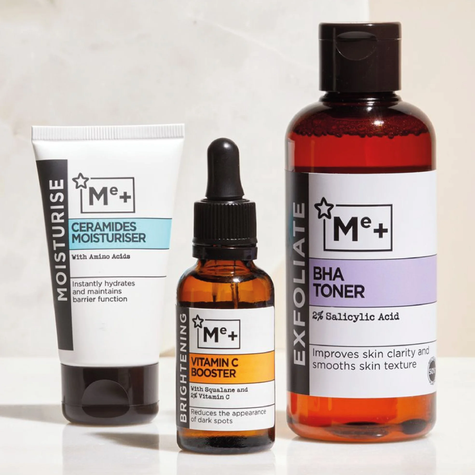
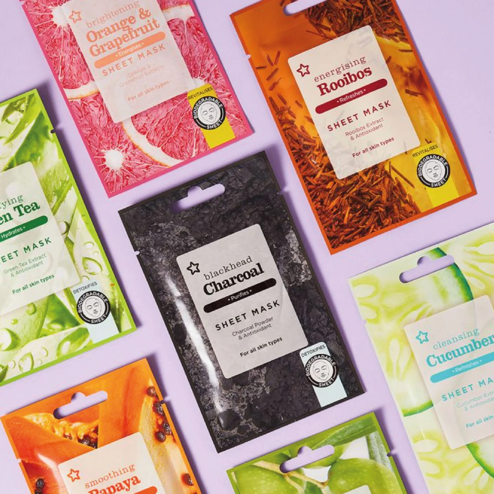
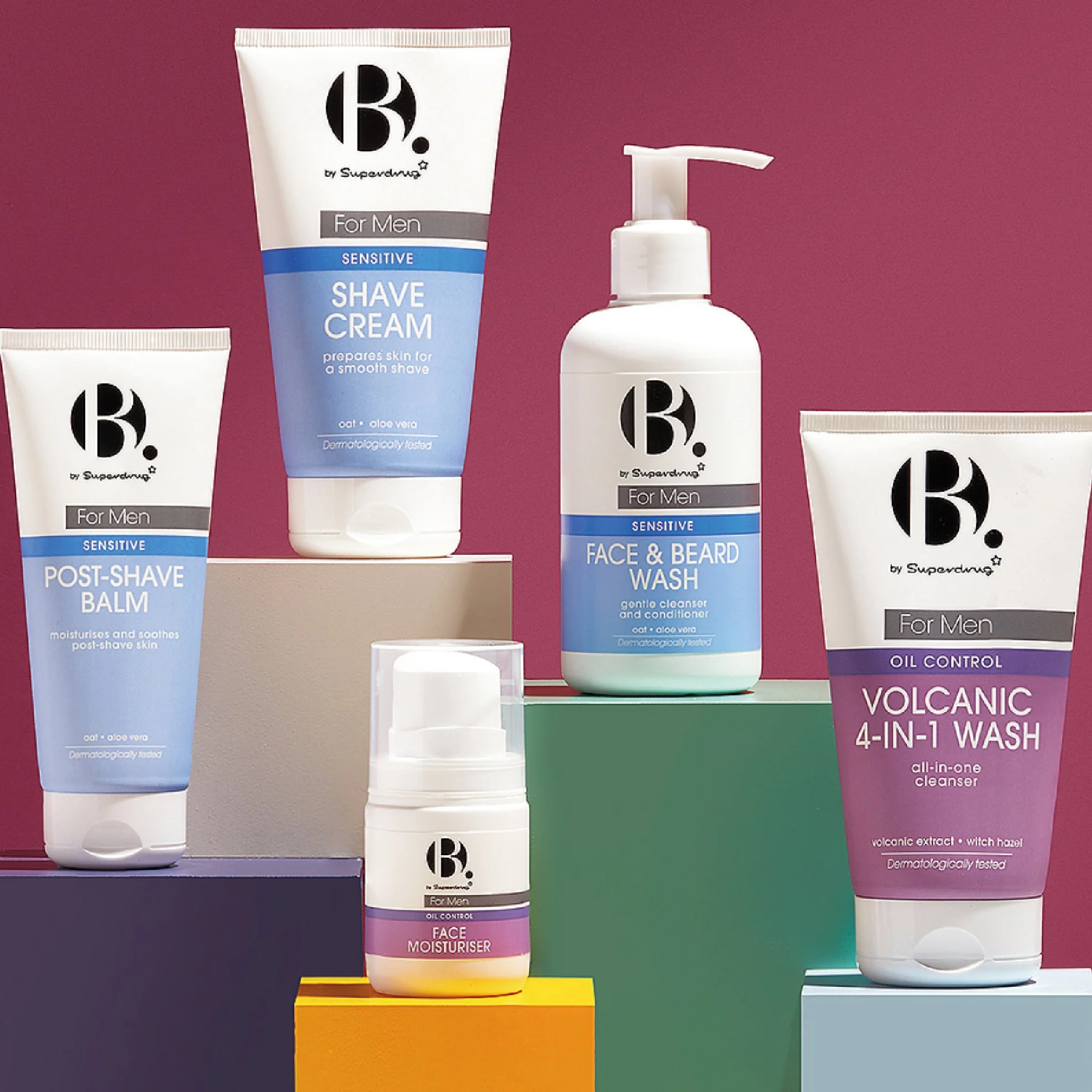
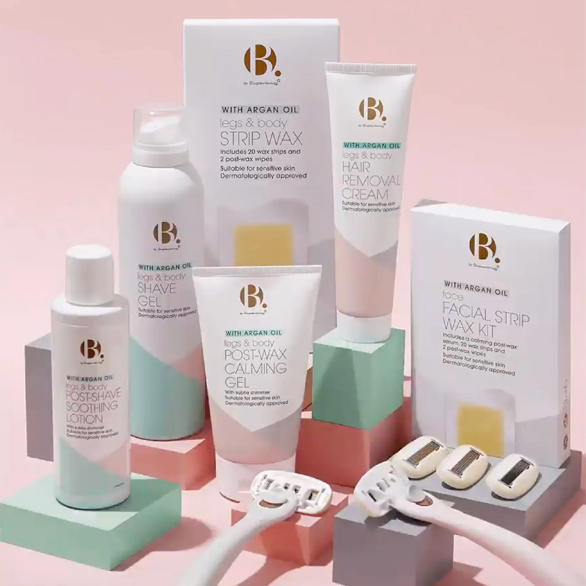
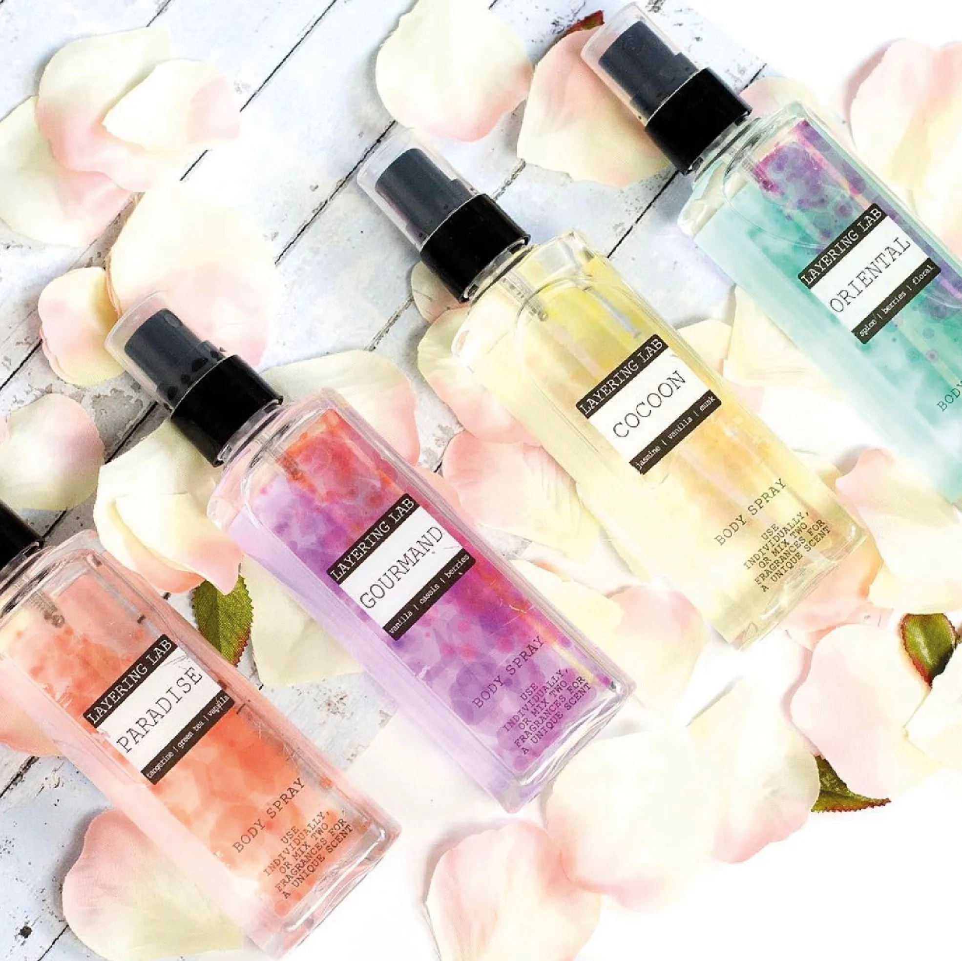
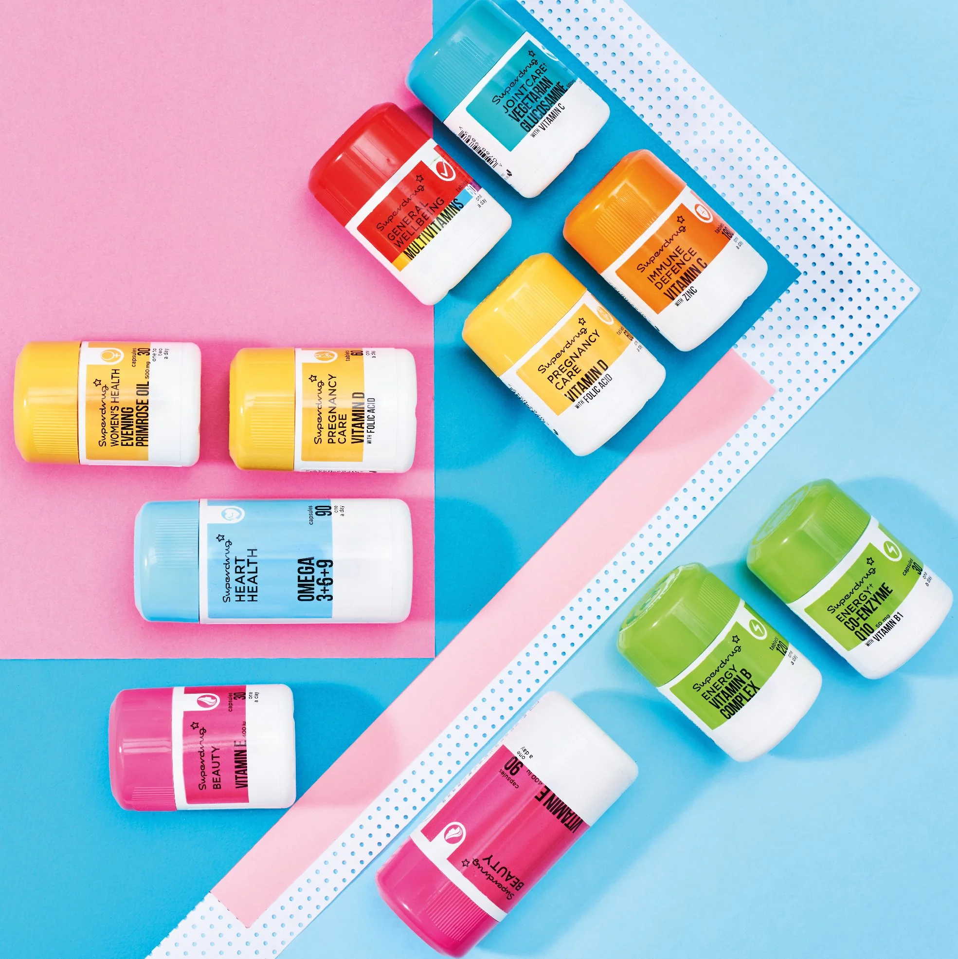
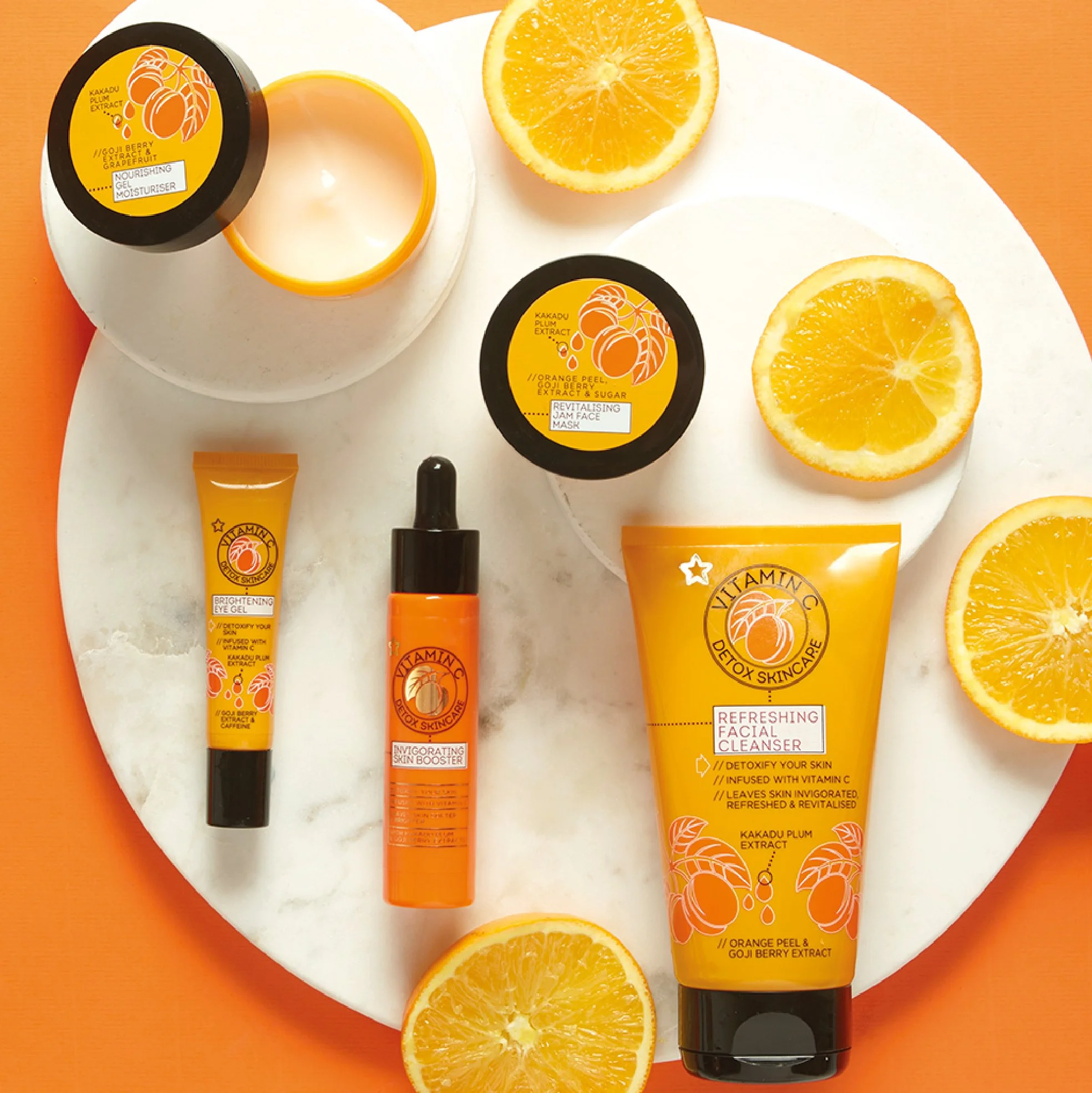
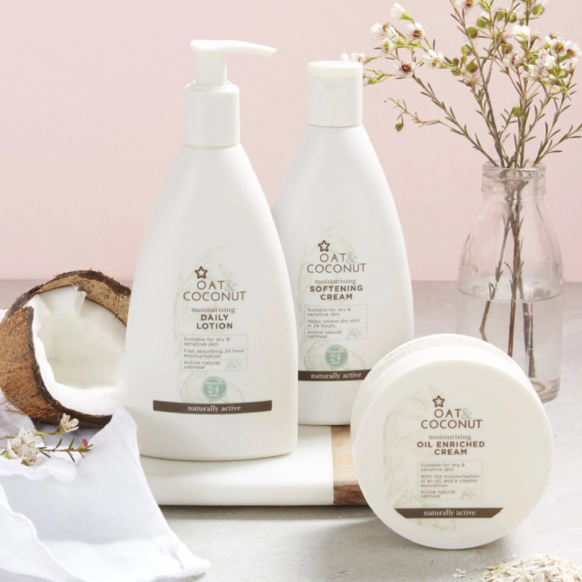
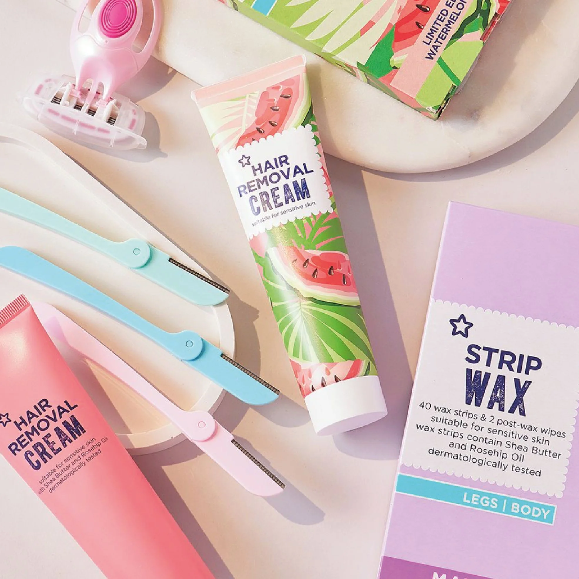
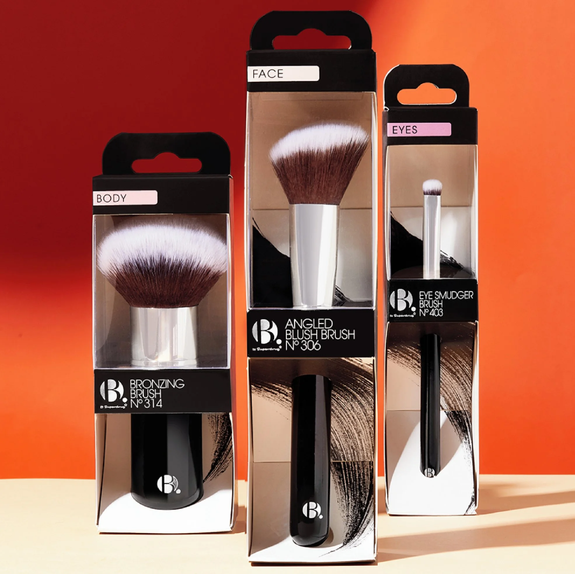
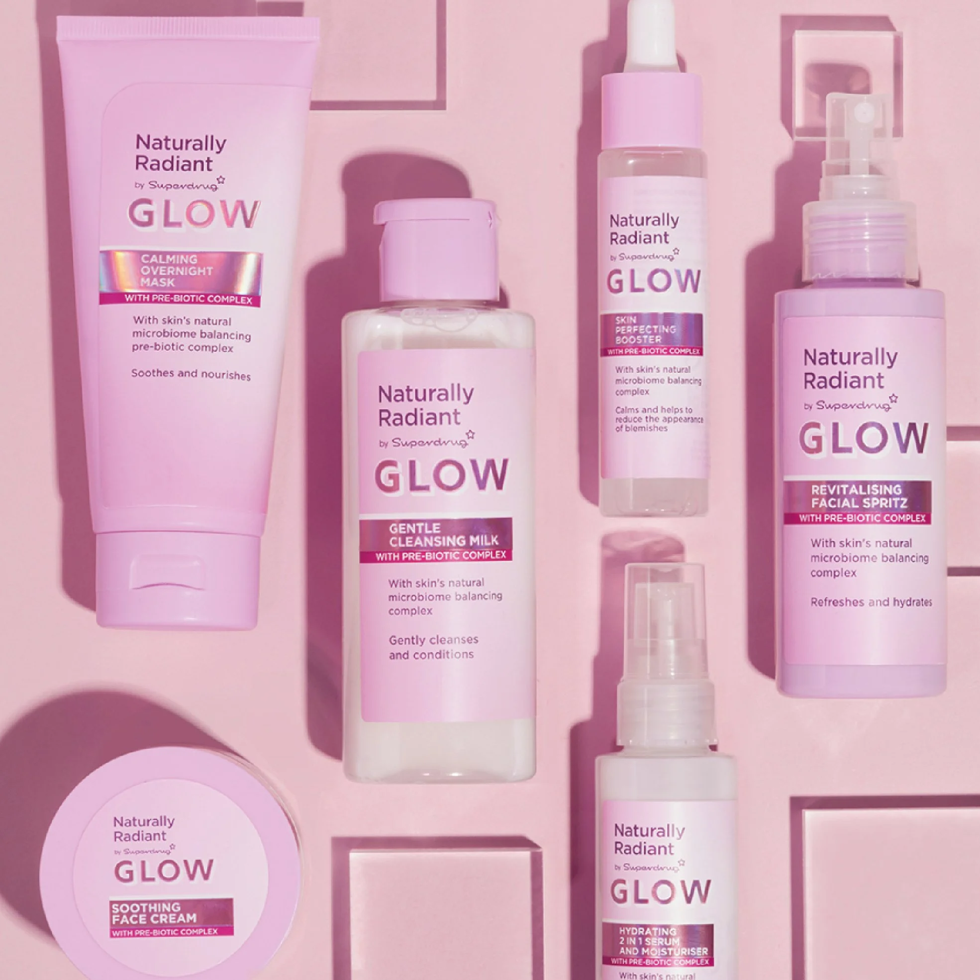
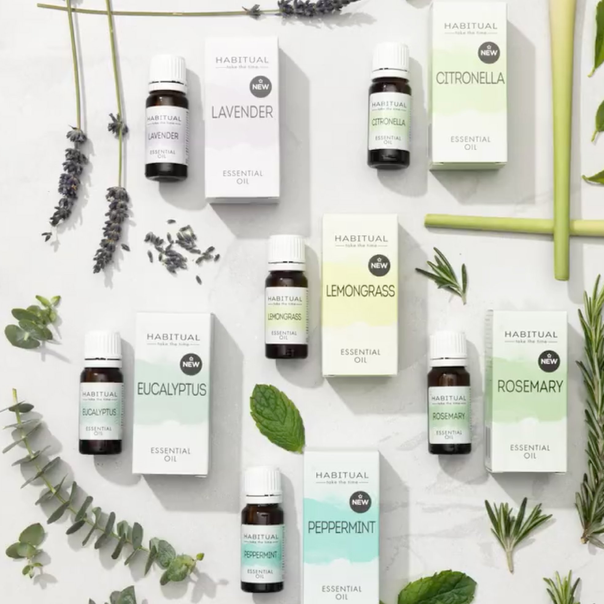
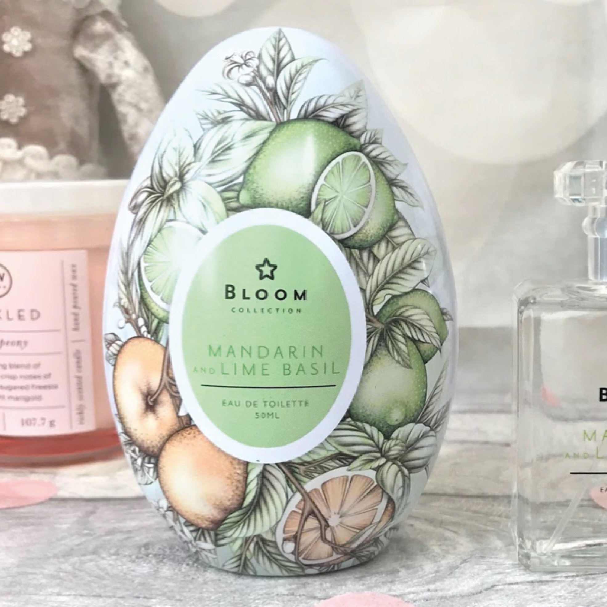
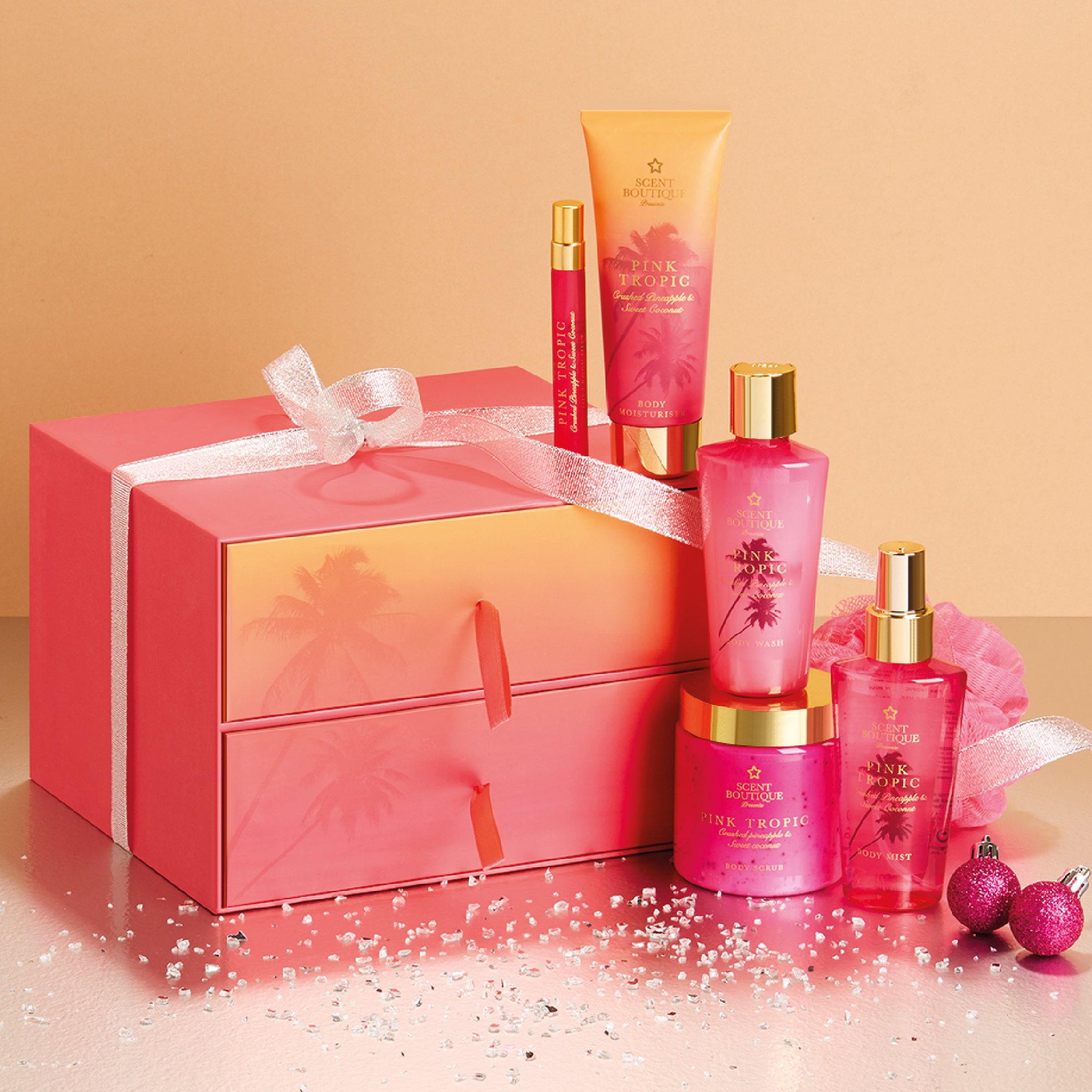
Below are a selection of ranges I created at Superdrug. I’m very pleased to say many are still in store today.