I’ve been working with the wonderful people at 7th Heaven for a few years now. Supporting their team with packaging, campaign and eexperiental design.
CORE RE DESIGN
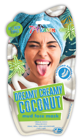
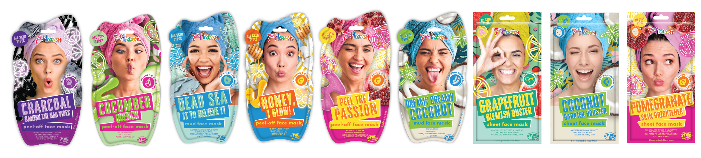
7th Heaven wanted to refresh its core face-mask range, moving away from AI-generated imagery and focusing on real people, ingredients and formulations.
The redesign combines nostalgic 90s references with bold colour, playful typography and ingredient-led graphics.
A model shoot was not an option so a big part of the project was how to use stock imagery effectively and make the models have a consistent look and feel.
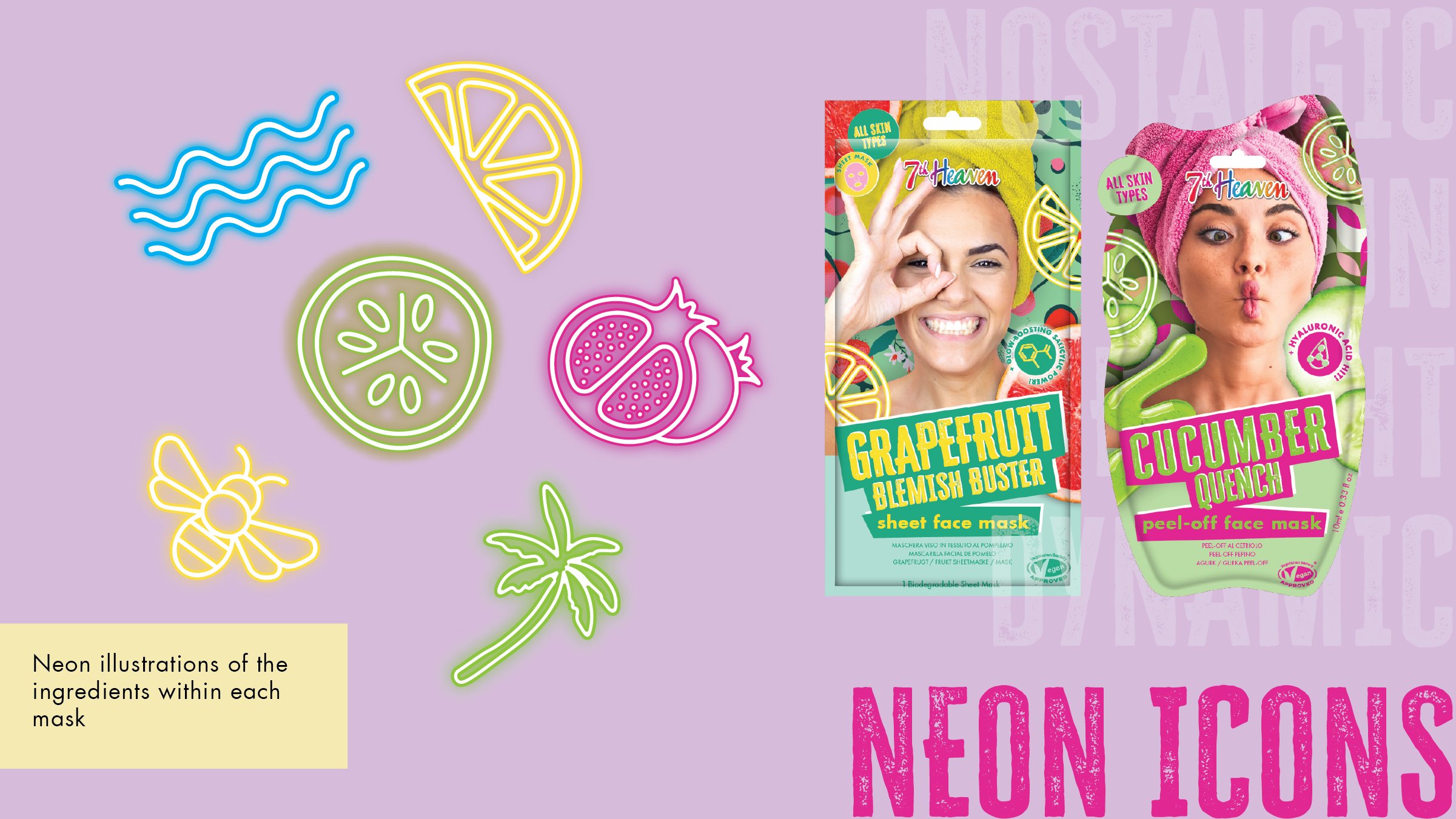
Using neon lighting effect illustrations nods back to a nostalgic 90s era, bold patterns and illustrations used in the background giving that fun and dynamic feel. Models pulling faces and having fun creates a fun and light hearted feel to the packaging.
The title sits on a bright background creating focus and grounding for the text.
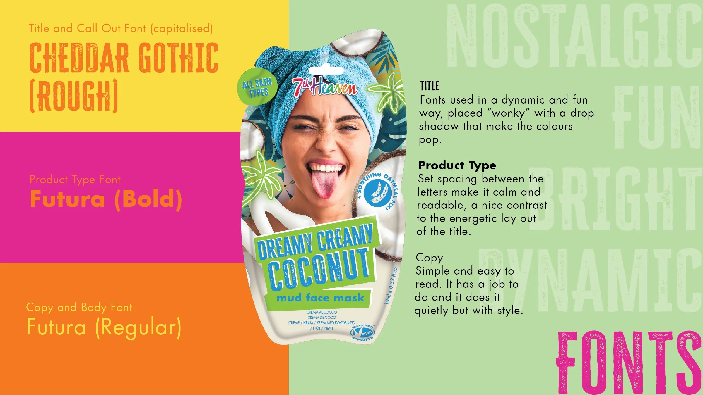
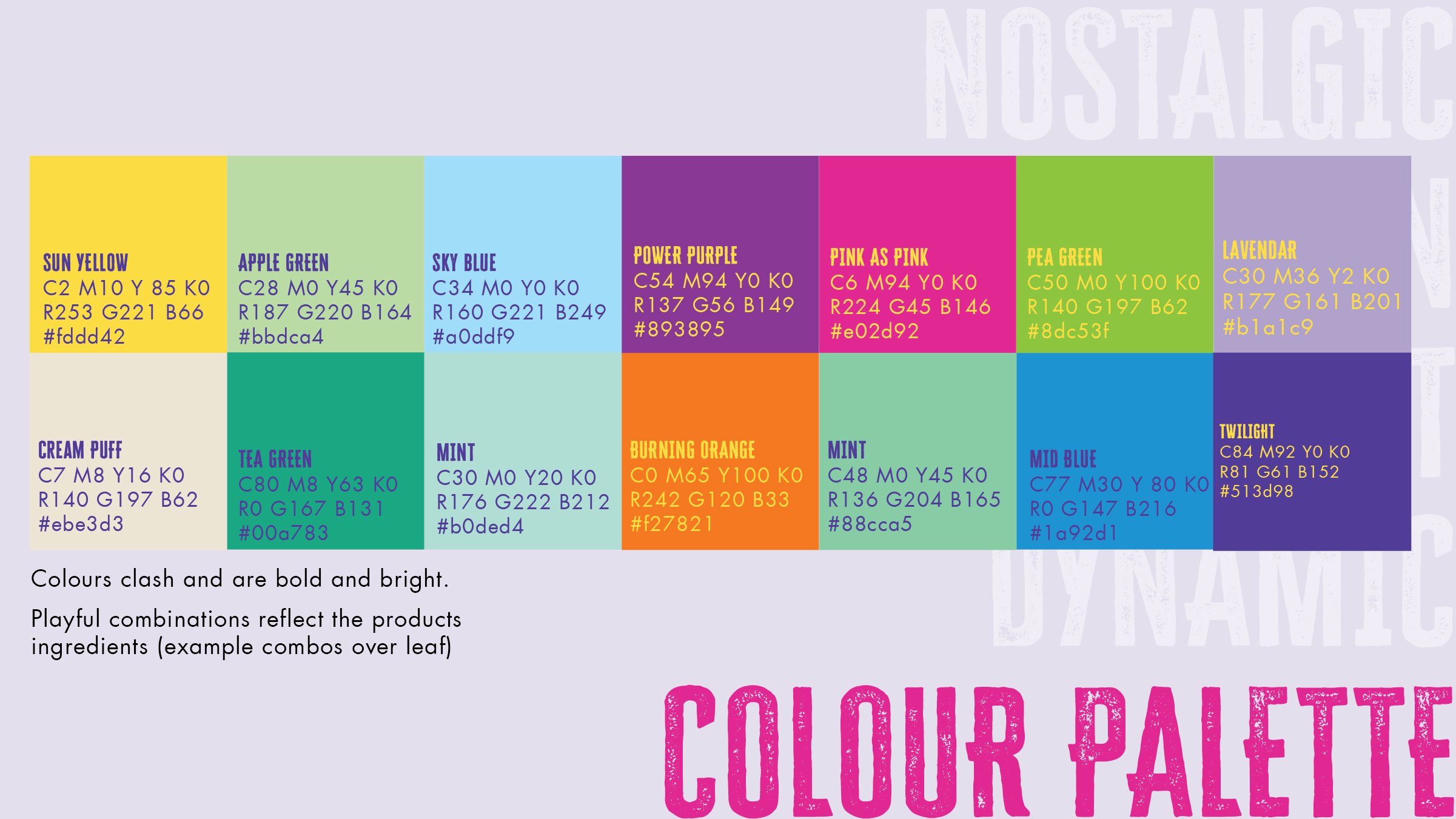
A few example pages from the style-guide created for the new design. Showcasing the fonts, colour palette and icons needed.
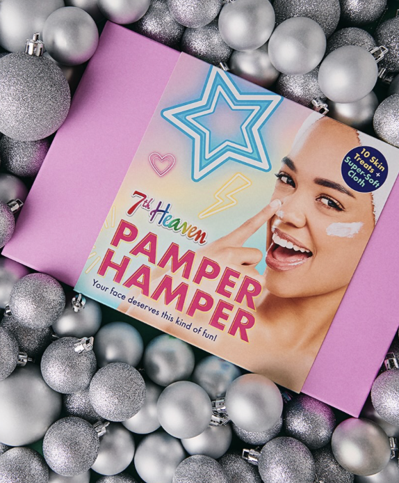
2025 gifting design
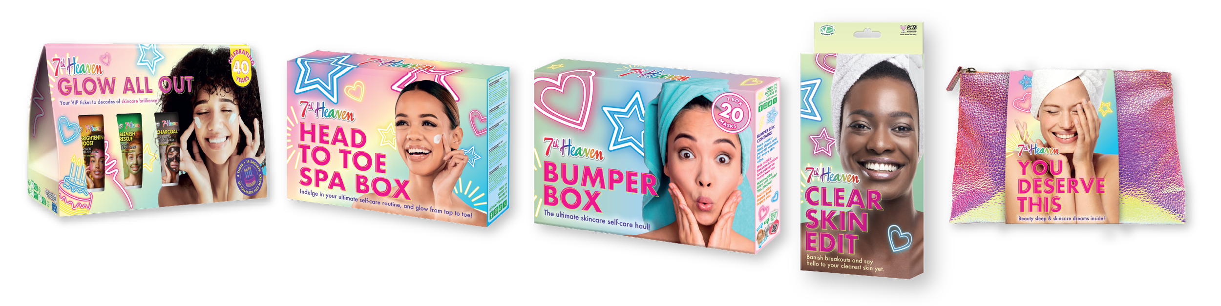
Shaking up their gifting offering with a totally new look and feel. Incorporating the new brand elements (neons and gradients) to create a fun and dynamic look.
I used pastel gradients to compliment the bright neon light illustrations and fun light hearted theme of the models expressions with vibrant pink product titles to create great and clear stand out.
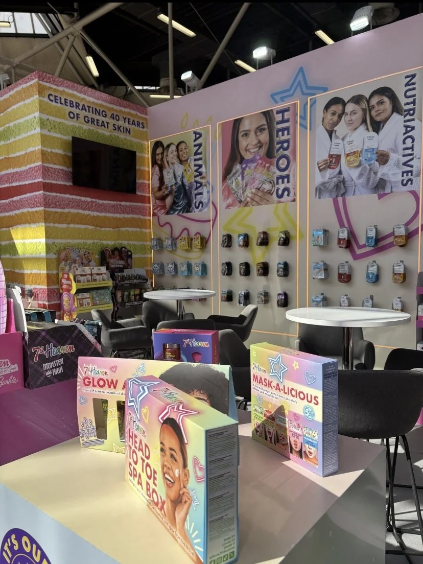
Comments from buyers when shown at 2025 Cosmoprof exhibition were that this was 7th Heavens the “best ever” gifting look.
4oth Birthday campaign - digital & print
With 7th Heaven turning 40 years old they wanted to celebrate. The brief was to create a design and kit of parts that could be used across all platforms.
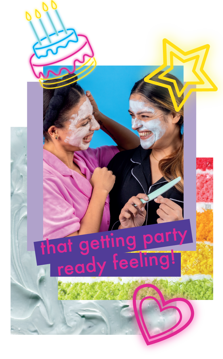
By creating bespoke neon light inspired illustrations it meant these could be added in the background of any communication to allow the campaign to be present without taking away from any other information needing to be conveyed.
The tabs and icon allow posts and adverts to wear a birthday style “badge” a nod to nostalic birthday cards that had your age on or “it’s my birthday”.
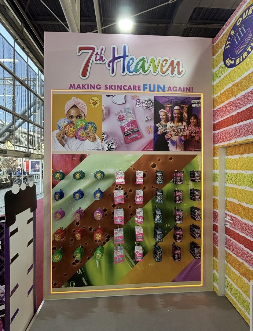
Bright colours overlayed on close up textures of cake give a fun feel to the whole campaign and again can be used subtly in other communications.
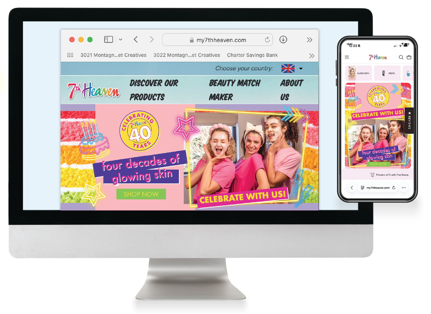

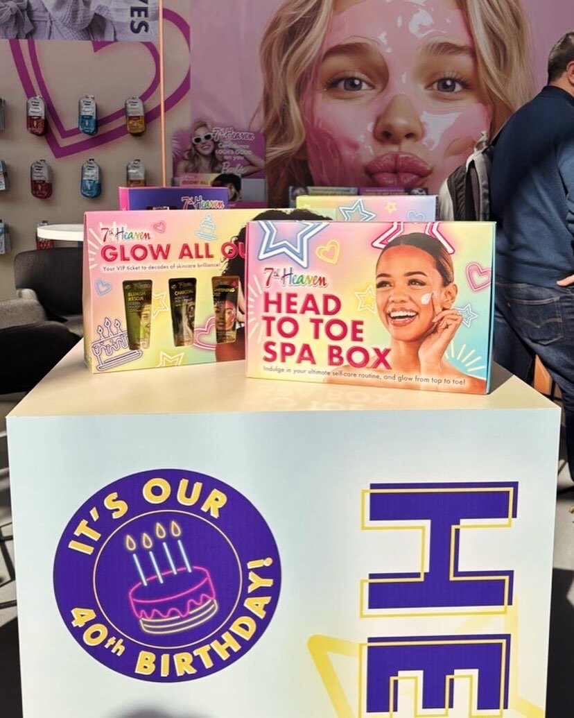
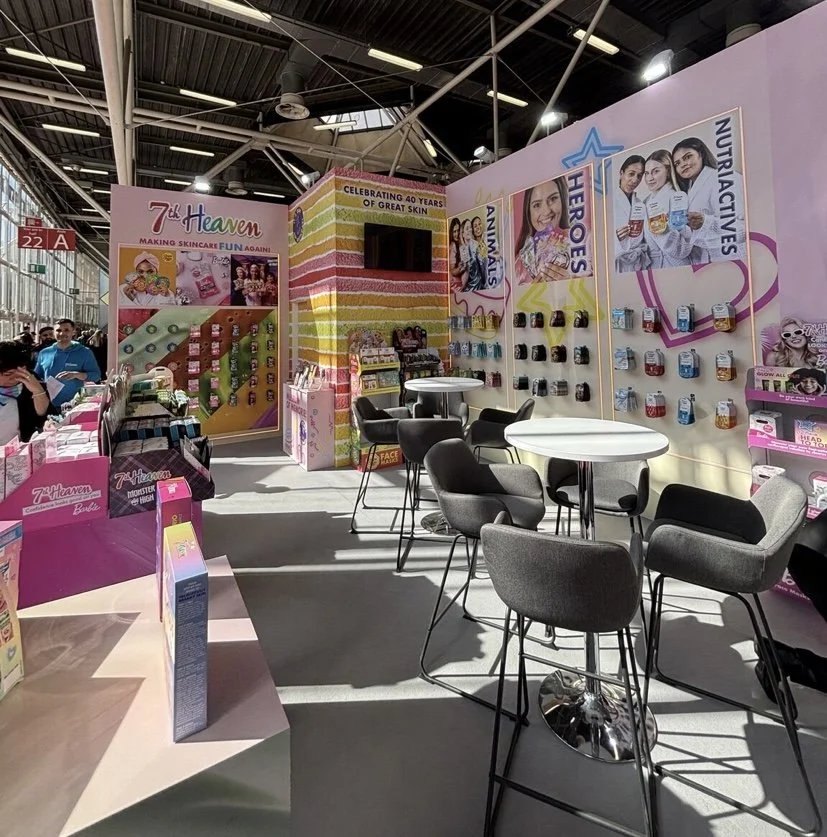
The campaign was a key part of the Cosmoprof 2025 stand. Using this imagery and the new look branding to re launch 7th Heavens new visual identity.