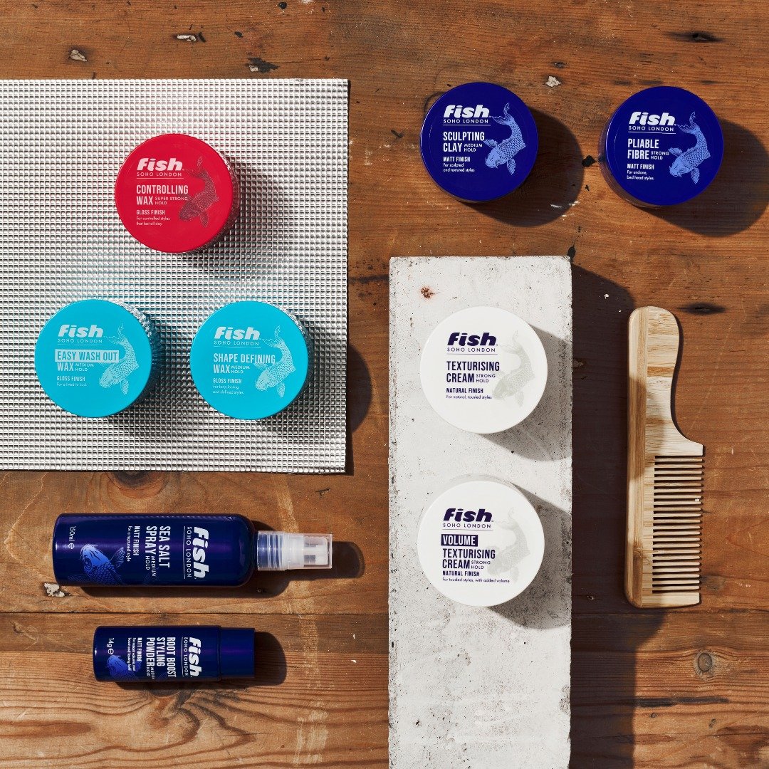
Fish is a brand that has been around for over 20 years. Initially starting out as a male hair salon in Soho in an old fish mongers - hence the name. The owner evolved the business and created “Fish” hair styling products.
RE DESIGN
Fish’s previous branding was looking dated and of its time - using neon effect text and textured walls in the background. Sale were slumping. It needed a re vamp.
I looked into the history of the brand and why it had its unusual name. I wanted to reconnect it to its routes - starting its life in edgy Soho in a shop that had previously had been a fish mongers.
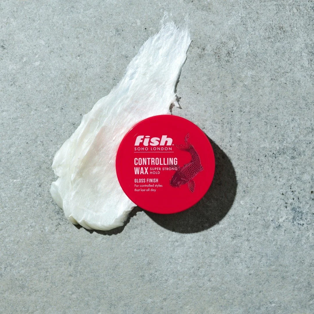
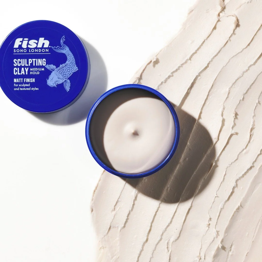
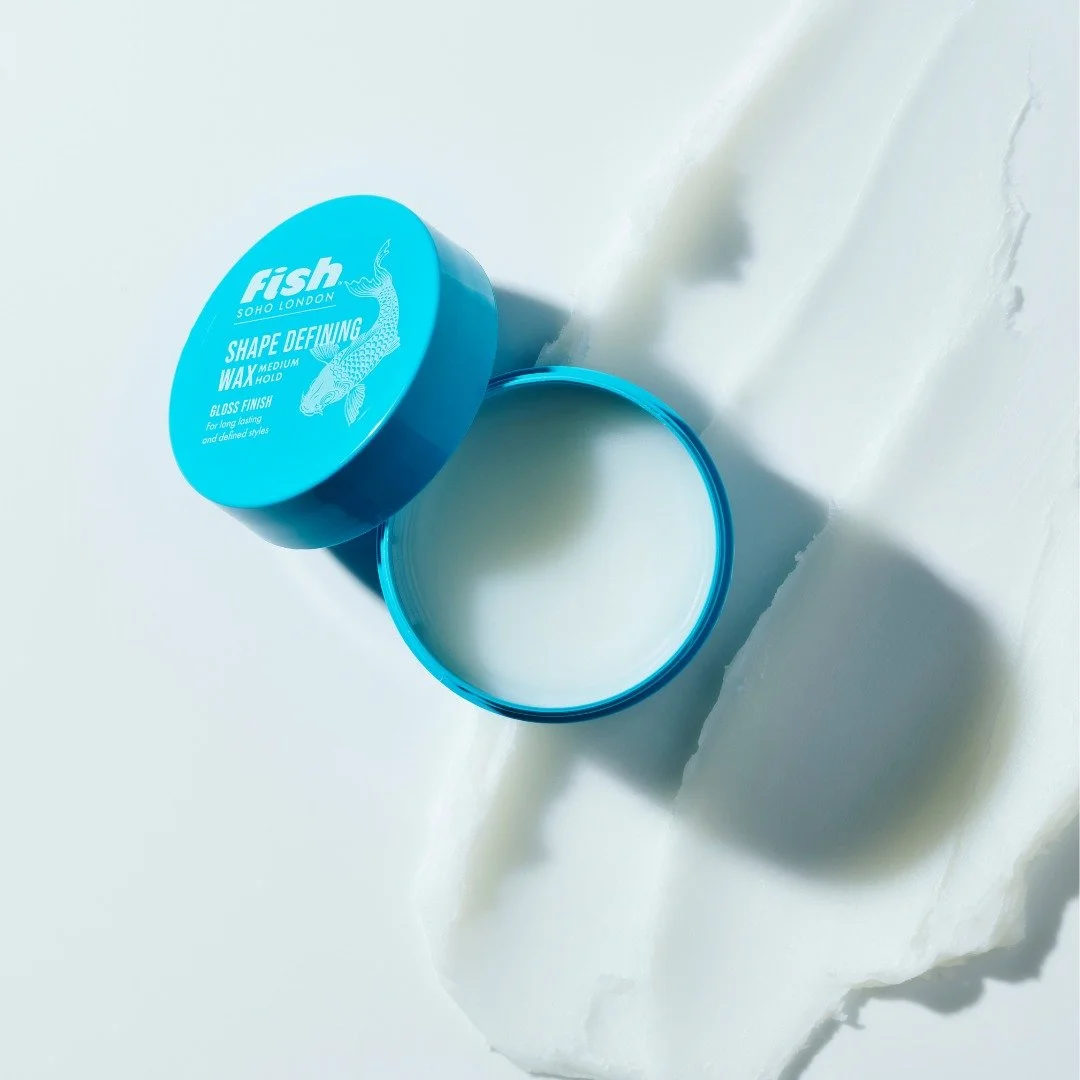
I used an illustration of a fish in a curved shape allowing it to “swim” round the title and copy on pack. with the idea that they would also “swim” in the background of any photography marketing material. The style of the illustration is inspired by the famous Japanese tattoo style used for carps and links to Soho, known for its edginess and tattoo studios.
I cleaned up the copy font and used a bold simple font with the hold strength clearly written close to the title.
Colours denoted the product finish - gloss, matt or natural (apart from the extreme sku that the CEO felt strongly should stay red for the consumer who had already bought into it).